How do I customise my Dialog based user interface (XpertForm View)?
Semantic UI
The Viabl.ai Platform has recently adopted the Semantic UI framework for CCS framework (replacing jQuery Mobile).
Semantic UI is a highly intuitive, word associated CSS framework that aims to make it easier for the user to build beautiful user interfaces. It uses human friendly words to allow the user to build up the html the way they see fit. This documentation will aim to convey the many ways you can implement these within the Viabl.ai Platform engine. For further information please see the semantic-ui documentation. Much of the functionality has been passed into the Viabl.ai Platform - try some of them and see what works!
Some of the basic classes you can add to your dialog are as follows:
Basic classes
| Colours |
|---|
| red |
| green |
| blue |
| teal |
| violet |
| black |
| grey |
| orange |
| yellow |
| pink |
| brown |
| olive |
| Sizes |
|---|
| mini |
| tiny |
| small |
| medium |
| large |
| huge |
| massive |
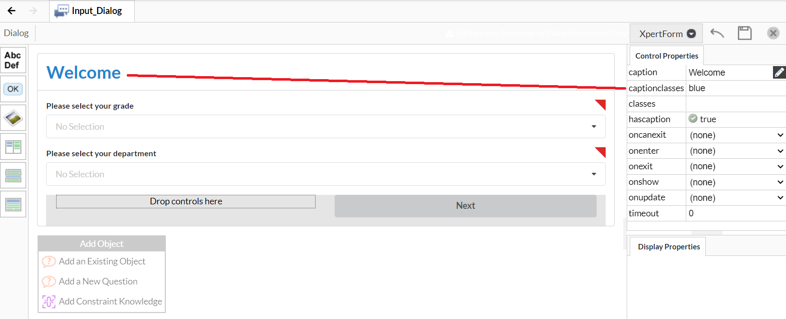
You can begin by colouring your dialog to fit your business needs. If you add the class blue, you will add a slight blue styling to your dialog. You can do this for captionclasses to change the style of your head, and classes to change the overall colour:
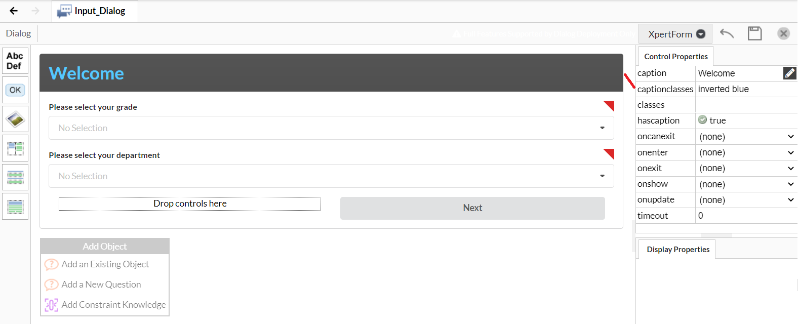
If you use the additional inverted keyword, you can alter the colour drastically:
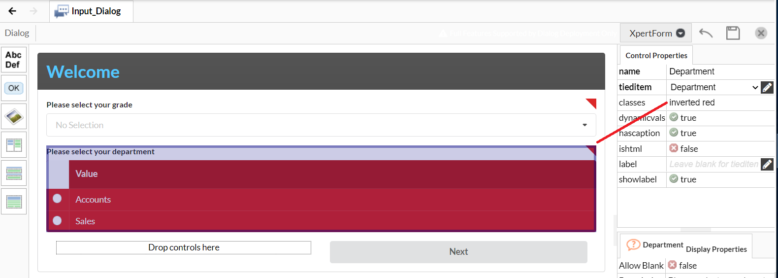
This also works for tables:
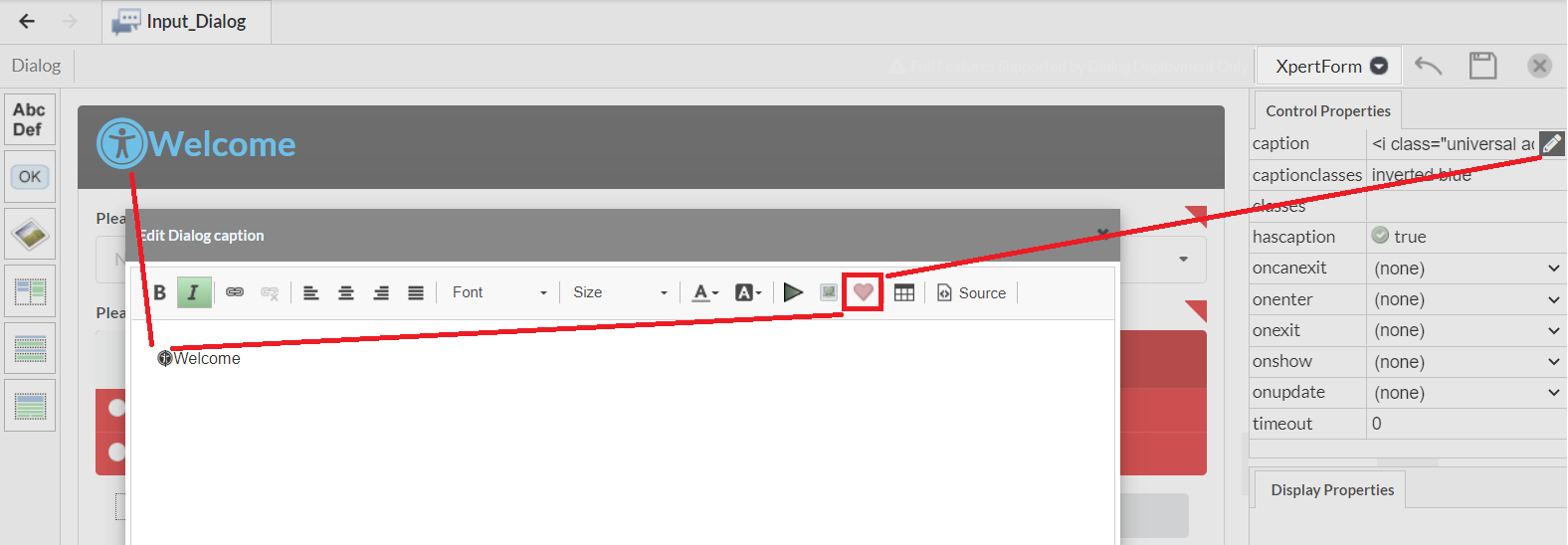
You can also add icons to different elements within your form by double clicking the description field on the right. This should bring up another dialog where you can click the 'heart' icon, and select one of sementic-ui's font awesome icons. Here is an example of a header with an icon. If you add the icon class to the classes field you can format it to display differently. You can also do this for labels.
Like other elements, you can also add inverted and basic classes to buttons to add additional styles.
orange buttons: 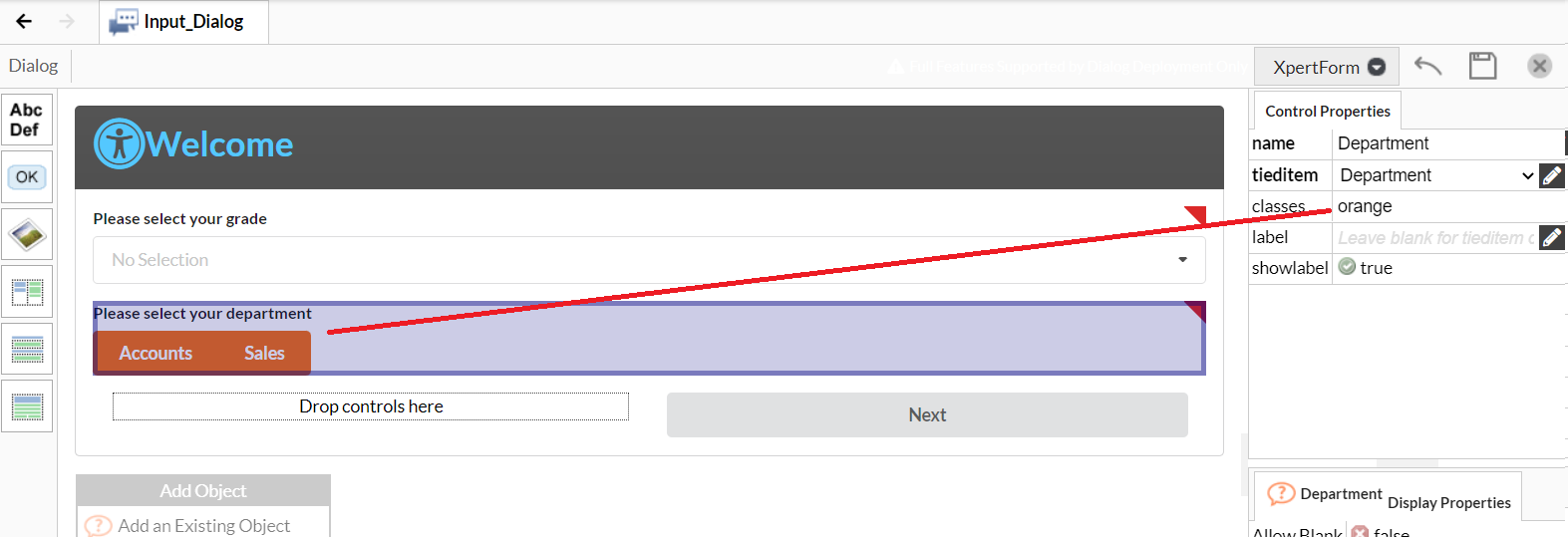
Inverted orange buttons: 
A massive button: 
You can also add labels and icons to buttons. This class is called "icon labeled" You can also position the icon on the right by specifying "icon right labeled"
If you want to edit the colour of the icon you can do it via the html that occurs after you enter the icon. The icons also react to the colour and size classes indicated at the top of this documentation. So you can have a massive green icon.

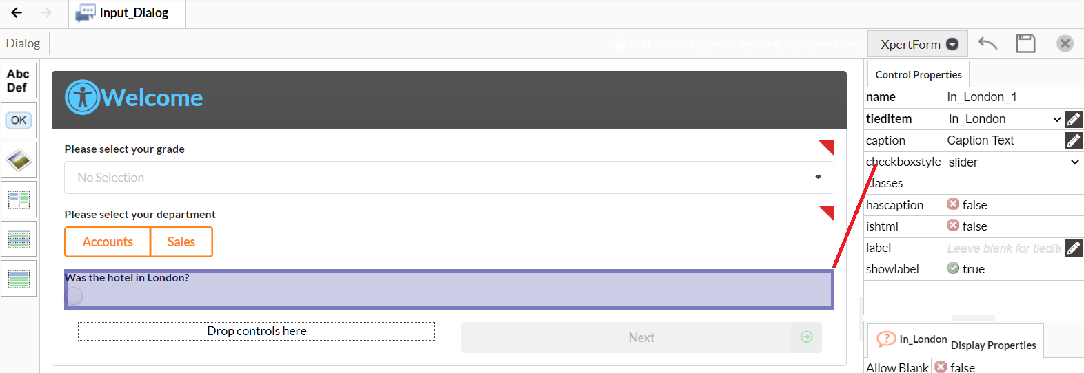
You can vary the styles of checkboxes also - these are available on a dropdown menu. They are toggle, slider and standard.
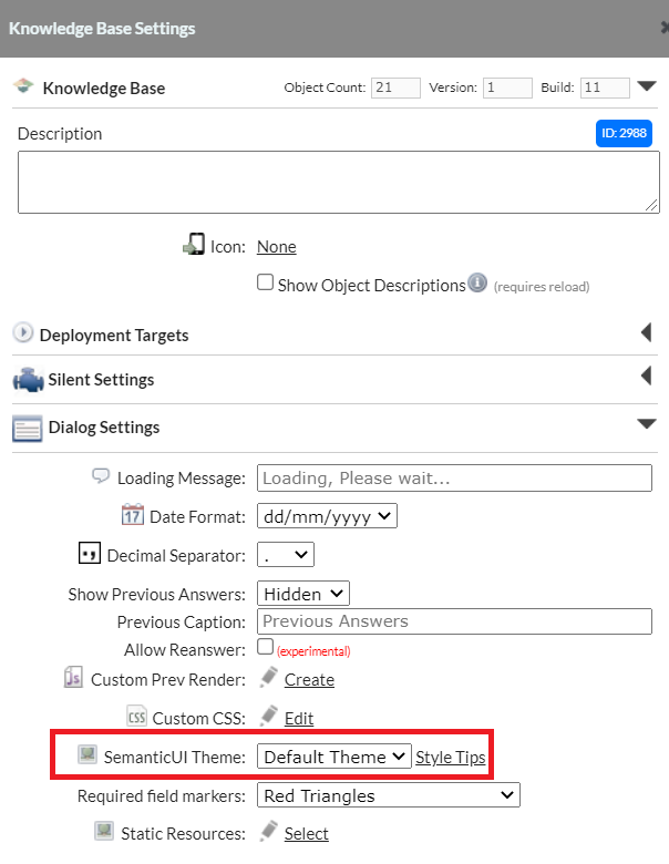
There are a variety of themes available, which you can view on the semantic UI website. These have been implemented in the Viabl Platform and you can change the theme via the Knowledge Base settings:
Standard CSS Tag Styling
It's easy to style standard HTML tags with the "Custom CSS" rules on the "Knowledge Base Settings" dialog.
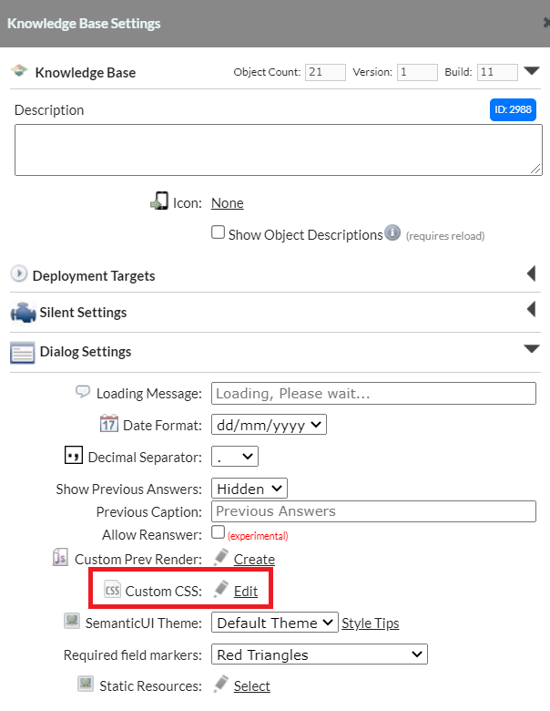
For example to use and style an tag in a dialog label...

We apply a style to the tag via the custom css editor...
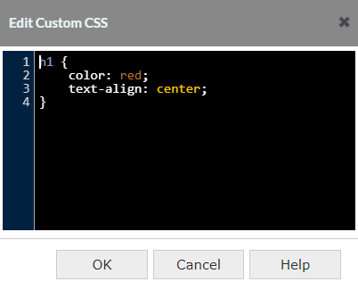
And when run the result is...
