Decision Mining Tools
Tree Context Decision Mining Tools

With our new selection of Decision Mining Tools, you can select any node along the splits within the tree to inspect your data at any point. These new tools include:
- Data Grid
- Statistics
- Frequency Distribution
- Scatter Distribution
- Time Series
- Correlation Matrix
Data Grid
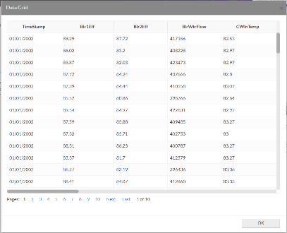
Here we select the data source to be used and we can view the data in a data grid format.
Data Statistics
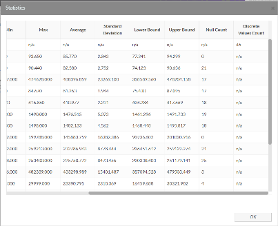
Here we can see the general statistics of each of the fields at that point in the tree.
Frequency Distribution
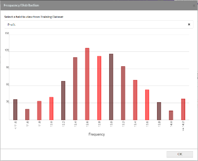
Frequency Distribution charts of both Numeric and Discrete Variables.
Scatter Distribution
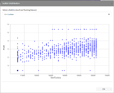
XY Scatter graphs can be produced here for numeric variables.
Time Series
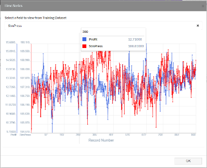
You can select which numeric field you wish against the output as stacked time series lines. Numerical Bounds are displayed on each graph representing the acceptable region. Features of these graphs include the ability to zoom.
The Correlation Matrix
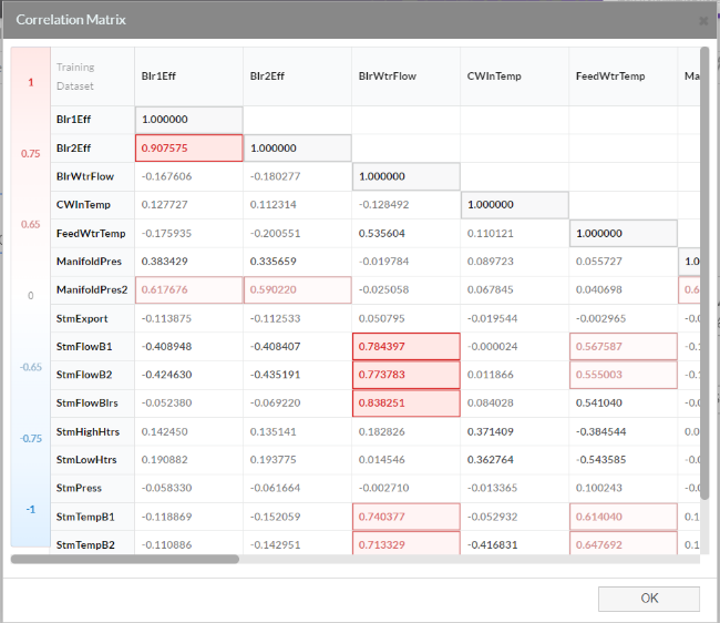
The population correlation calculation returns the covariance of two data fields divided by the product of their standard deviations. Use the Correlation Matrix tool to determine whether two fields move together — that is, whether large values of one field are associated with large values of the other (positive correlation), whether small values of one field are associated with large values of the other (negative correlation), or whether values in both fields are unrelated (correlation near zero). Large positive correlation (values above 0.75) are highlighted in red as Hotspots. Large negative correlation (values below –0.75) are highlighted in blue as cold spots.
Model Verification
You can select our model verification tool by clicking on the tick icon (above) on the decision mining top navigation menu. Here you can find a variety of tools that will help you verify your data.
Statistics
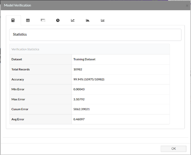
On this tab, you can find a series of basic statistics. These include:
- Accuracy
- Average Error = Σ Abs(Measured – Modelled)
- Number of Records
- Max Error = Max(Abs(Measured – Modelled))
- Min Error = Min(Abs(Measured – Modelled))
- Cusum Error = Σ Abs(Measured – Modelled)
Data Explorer
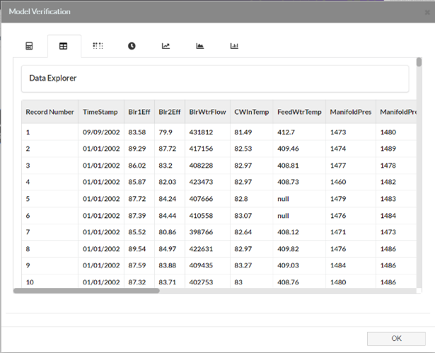
The Data Explorer allows you to view all your available data in one place. You can check each row of data against an accuracy reading that will allow you to verify each row in your decision mining table.
Coherence Verification
Shows the Measured (x) Vs Modelled (y). The axis limits are initially the same for x and y so a 45˚ Line through the origin would represent a perfect model. The closeness of tfit to this determines the accuracy of the model.
Line Series Verification
The measured and modelled fields will be plotted as stacked Times Series Graphs at the same time. Time Series Graphs support Zooming and Scrolling. Each will appear on its own Y axis.
Cusum Of Residual Errors
This charts the cumulative sum of the absolute errors (|Measured Value – Modelled|) over all records. This supports zooming with the record number on the X and the errors on the Y.
- Σ Abs(Measured – Modelled)
Residual Errors Frequency Distribution
A Frequency Distribution of the Residual (Measured – Modelled Values) will be distributed alongside bands on the x axis.
- Abs(Measured – Modelled)